
Climate scientists baffled as to why Antarctica has not warmed in 70 years despite rising CO2 levels
 NicoElNino/Shutterstock

 Most alarmist commentary centres around the cyclical loss of sea ice around the coast and some warming on parts of the west of the continent. But sea ice cover is running at levels seen around 50 years ago, as the graph below shows. Small rises and falls in the early 2010s have been followed by a reversion to the mean.


The average ice thickness in Antarctica is about 2,160 metres and compares with Greenland at around 1,600. The fact that Greenland has warmed of late might lead to the cynical observation that Antarctica has the wrong type of ice. One correspondent summarized the paper as the “lack of warming in spite of greenhouse gases is the wrong conclusion. The lack of warming is because of the increased greenhouse gases.” Another sighting, it would appear, of the old chestnut, “global cooling is caused by global warming.”


Trends in Atmospheric Carbon Dioxide
- NOTE: Starting Feb. 10, 2021, the CO2 data are now on the WMO X2019 scale. Read about the CO2 Scale for more details.
- Can we see a change in the CO2 record because of COVID-19?
Global Monthly Mean CO2
| October 2022: | 416.22 ppm |
| October 2021: | 413.84 ppm |
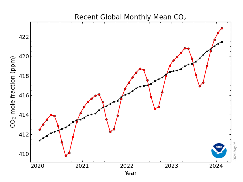
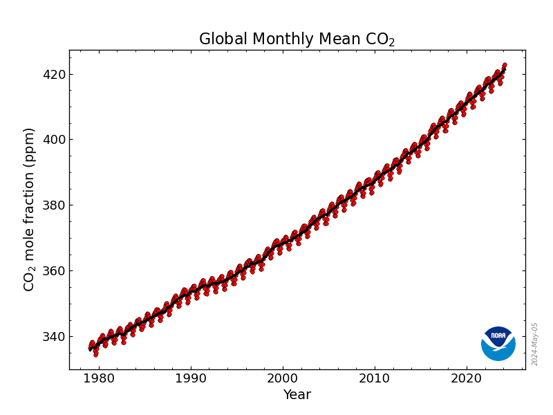
Measurements
All measurements used to estimate surface global means are made by GML and CU/INSTAAR (for stable isotopes). Routine and ongoing comparison experiments within the Boulder labs help ensure that measurements are internally consistent with respect to calibration and methodology [WMO, 2009a]. All data used to construct the global estimates have been screened by the principal investigators. Only measurements determined to be free from sampling and analysis artifacts are considered for the calculation of the global estimate. Figure 1 shows all CO2 measurements of samples collected at Ascension Island. The determination of the global mean surface time series is one of several products derived from the Data Extension methodology, which is described briefly below. A configuration file provides execution details for a specific Data Extension run including the list of designated MBL sites, which may differ for different trace gas species.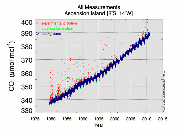
Smooth Curve fit to MBL data
To reduce noise in the determination of the global estimate due to synoptic-scale atmospheric variability and measurement gaps, we fit a smooth curve to the weekly measurements. To approximate the long-term trend and average seasonal cycle at a site (subscript “STA” for station), a function of the formfSTA(t) = ao + a1t + a2t2 + ∑k=1,4[b2k-1sin(2πkt) + b2kcos(2πkt)]
is fitted to the measurements [Thoning et al., 1989]. The above function includes 3 polynomial parameters (quadratic) and 8 harmonic parameters, sine and cosine which can be converted to amplitude and phase of each harmonic, if desired. The initial number of parameters chosen can vary depending on the trace gas, the site and the sampling frequency. To account for interannual variability in the seasonal cycle, the residuals, rSTA(t) = cSTA(t) – fSTA(t) where cSTA(t) denotes the actual observations, are digitally filtered through a low-pass filter with a full width at half maximum (FWHM) set to ~40 days. The smooth curve is then defined asSSTA(t) = fSTA(t) + {rSTA(t)}40day
Figure 2 shows the smooth curve, S(t), fitted to background CO2 measurements from Ascension Island for 2000-2009. The curve fitting parameters including number of polynomial and harmonic terms and the FWHM setting are specified for each site in the Data Extension configuration file.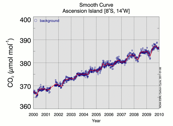
Extended Records
We define a synchronization period with 48 time steps per year (~ weekly) for which the global mean surface values will be determined. For CO2, the synchronization period begins January 1, 1979; the ending date depends on the application. We then extract values from the smooth curve where measurements exist and gaps are less than 8 weeks in length. Measurement gaps exceeding 8 weeks are filled using the data-based, data extension methodology described by Masarie and Tans [1995] with important revisions documented in the GLOBALVIEW-CO2 [2010]. The data extension procedure produces a set of extended records, which are synchronized in time with 48 “weekly” values per year and have no gaps. Figure 3 shows the Ascension Island extended record for 2000-2009.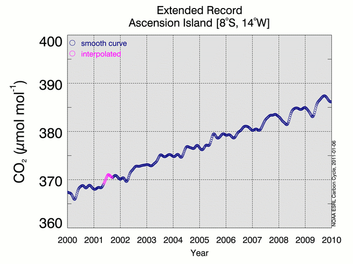
Curve fit to weekly MBL data latitudinal distribution
For each week in the synchronization period, we construct a latitudinal distribution (CO2 (ppm) versus sine (latitude) using smoothed and interpolated values from the extended records. The number of values available for the distribution can vary weekly due to measurement gaps in records or as MBL sites are added to the GML network or terminated. Confidence in values extracted from the smooth curve, SSTA(t), depends on the density of the data, the “scatter” in the data and the length of the measurement period. We use a relative weighting scheme, which assigns greater significance to sites with high signal-to-noise and consistent sampling. Relative weights range from 1 to 10 where the minimum weight of 1 is reserved for all interpolated values. A curve is then fitted to each weekly weighted latitudinal distribution. Details of the latitudinal fitting process are described by Tans et al. [1989]. Figure 4 shows the fit to the latitudinal distributions for 16 September 1980 and 2009.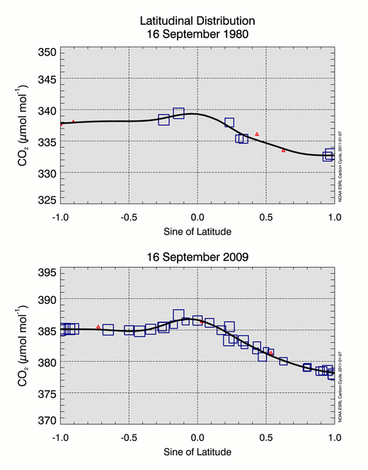
Creating the NOAA GML surface
Values are extracted from each weekly latitudinal fit at intervals of 0.05 sine of latitude from 90°S to 90°N and joined together to create a 2-dimensional matrix (time versus latitude) of CO2 values. We can then construct a three-dimensional representation of the global distribution of atmospheric CO2 as shown in Figure 5.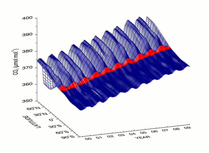
The surface global mean time series
Using the above 2-dimensional matrix, we can construct a zonal average time series for any specified latitude band or extract a time series at a specific latitude. The global mean surface CO2 time series (Figure 6) is created by computing, for each week, the latitude-weighted mean value for the band 90°S to 90°N.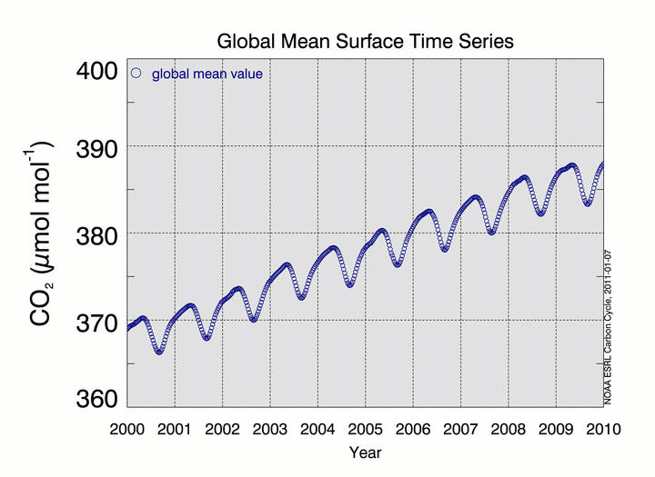
Discussion
The World Meteorological Organization (WMO) World Data Center for Greenhouse Gases (WDCGG) also publishes global averages for CO2 and other gases. WDCGG uses curve fitting and data extension methods very similar to those developed by NOAA [WMO, 2009b], but in addition to marine boundary layer sites, WDCGG includes many continental locations strongly influenced by local biospheric sources and sinks and also by fossil fuel emissions. WDCGG also includes sites from multiple independent laboratories which raises the issue of possible artifacts due to scale or measurements differences. The WDCGG global average has a positive mean offset of ~0.35 ppm and a larger seasonal cycle amplitude compared to NOAA results. The MBL estimate is expected to be lower than a full global surface average because areas with high fossil fuel loading due to recent emissions are not represented. On the other hand, the full troposphere (up to ~8-15 km altitude) and especially the stratosphere with lower CO2 mole fraction are not represented in either approach. We observe that CO2 is increasing at about the same rate everywhere it is measured. Because CO2 is a long lived gas in the atmosphere, emissions anywhere will, in about one year, contribute to higher CO2 everywhere. One cannot “hide” CO2 emissions from the MBL sites for more than about a month. Thus the MBL gives probably the best low-noise representation of the ongoing global increase of CO2. We continue to base our global average on MBL sites because it is not clear how to properly weight continental sites in a global average. Our evidence so far indicates that the NOAA MBL global average is representative, internally consistent and stable over time with respect to the addition of new MBL sites.References
- Conway, T.J., P.P. Tans, L.S. Waterman, K.W. Thoning, D.R. Kitzis, K.A. Masarie, and N. Zhang, 1994, Evidence for interannual variability of the carbon cycle from the NOAA/CMDL global air sampling network, J. Geophys. Res., 99, 22831-22855.
- Dlugokencky, E.J., L.P. Steele, P.M. Lang, and K.A. Masarie, 1994, The growth rate and distribution of atmospheric methane, J. Geophys. Res., 99, 17,021-17,043.
- GLOBALVIEW-CO2: Cooperative Atmospheric Data Integration Project – Carbon Dioxide. NOAA ESRL, Boulder, Colorado, 2010. gml.noaa.gov/ccgg/globalview/co2/co2_intro.html.
- Masarie, K.A. and P.P. Tans, 1995, Extension and Integration of Atmospheric Carbon Dioxide Data into a Globally Consistent Measurement Record, J. Geophys. Res., .100, 11593-11610.
- Novelli, P.C., L.P. Steele, and P.P. Tans, 1992, Mixing ratios of carbon monoxide in the troposphere, J. Geophys. Res., 97, 20,731-20,750.
- Tans, P. P., T. J. Conway and T. Nakazawa, 1989, Latitudinal distribution of the sources and sinks of atmospheric carbon dioxide derived from surface observations and atmospheric transport model, J. of Geophys. Res., 94., 5151-5172.
- Thoning, K.W., P.P. Tans, and W.D. Komhyr, 1989, Atmospheric carbon dioxide at Mauna Loa Observatory, 2. Analysis of the NOAA/GMCC data, 1974 1985., J. Geophys. Res. ,94, 8549 8565.
- Trolier, M., J.W.C. White, P.P. Tans, K.A. Masarie and P.A. Gemery, 1996, Monitoring the isotopic composition of atmospheric CO2: measurements from the NOAA Global Air Sampling Network, J. Geophys. Res., 101, 25897-25916.
- 14th WMO/IAEA Meeting of Experts on Carbon Dioxide Concentration and Related Tracers Measurement Techniques (Helsinki, Finland, 10-13 September 2007) WMO TD No. 1487, April 2009a.
- Tsutsumi, Y., M. Kazumasa, H. Takatoshi, I. Masaaki and T.J. Conway, Technical Report of Global Analysis Method for Major Greenhouse Gases by the World Data Center for Greenhouse Gases, WMO TD No. 1473, June 2009b.
Links from humanity and Earth
The end of democracy, UN dark side?
War and it’s participants by Dr Jung?
Behind the Veil?
Use of Fear and guilt to control/push humans.
Madness?
Our genetic soul structure & mammals
Edgar Cayce and Baba Vanga and 2025?
“All-that-is”
5D new earth?
Pushing the NWO/WEF agenda within the UN.
“Novo Nordisk, which has made nearly $50 billion in sales off of Ozempic and Wegovy, charges Americans almost $1,000 a month
Aspirin’s Forgotten Anticancer Function
Humans as source of food/energy.
The origin of the climate change agenda.
New Earth, Did they the deep State see it ever coming?
Earthquakes tsunamis and other Elemental forces now active and will change planet Earth forever.
Part of the Most Impossible Decade of the Century and 2026, the GRAND FINALE
The battle between the dark forces and light beings?
Contact/communication between you and planet Earth?
Extra-terrestrial control of planet earth.
Earth, planet of slaves.
EU and climate change?
Pushing WW3, preparation, set-up and Push.
The Lithium needed to secure the EU Renewable Energy Transition?
EU in trouble again?
A Critical Analysis of All-Cause Deaths during COVID-19 Vaccination in an Italian Province
Under “corporatism”, monolithic predator corporations run around sucking up as much wealth and economic power as they possibly can.
Inversion ongoing & alien interventions?
‘1 in a billion’ chance COVID emerged from nature.
Our biological human body has two centres, one our brain and second our heart as energy centre.
How to control anyone at anytime
how Society is Organised for Controlling and Exploiting People
Behind the current coup, alien intervention!
Attempt to radically change our economic and social lives?
Aliens and the NAZI connection
Last Step, Martial law will be introduced.
Climate change no offence mend
-
NATO & Russia and the introduction of official censorship in the EU.
The big ( Privat) Central Banks.
Population control attempts & history
Mind Control Techniques The fifth column,
New, Health & Bible, lifestyles!
End to Green dictate by the EU, IMF, World Banks others.
UN & NWO Monkey Virus DNA Found in COVID-19 Shots
Cheats, liars and greed our newly elected Saints.
“We are the Borg. Resistance is futile. Your race will be assimilated and service to us.”
“A Covenant With Death”, by Bill Cooper.
The great Awakening, Plandemic 3 Video, please click on link:
The Great Awakening (Full, Unedited Movie) (rumble.com)
rumble.com/v2s0gp8-plandemic-3-the-great-awakening-full-unedited-movie.html